D’Amelio Terras Gallery
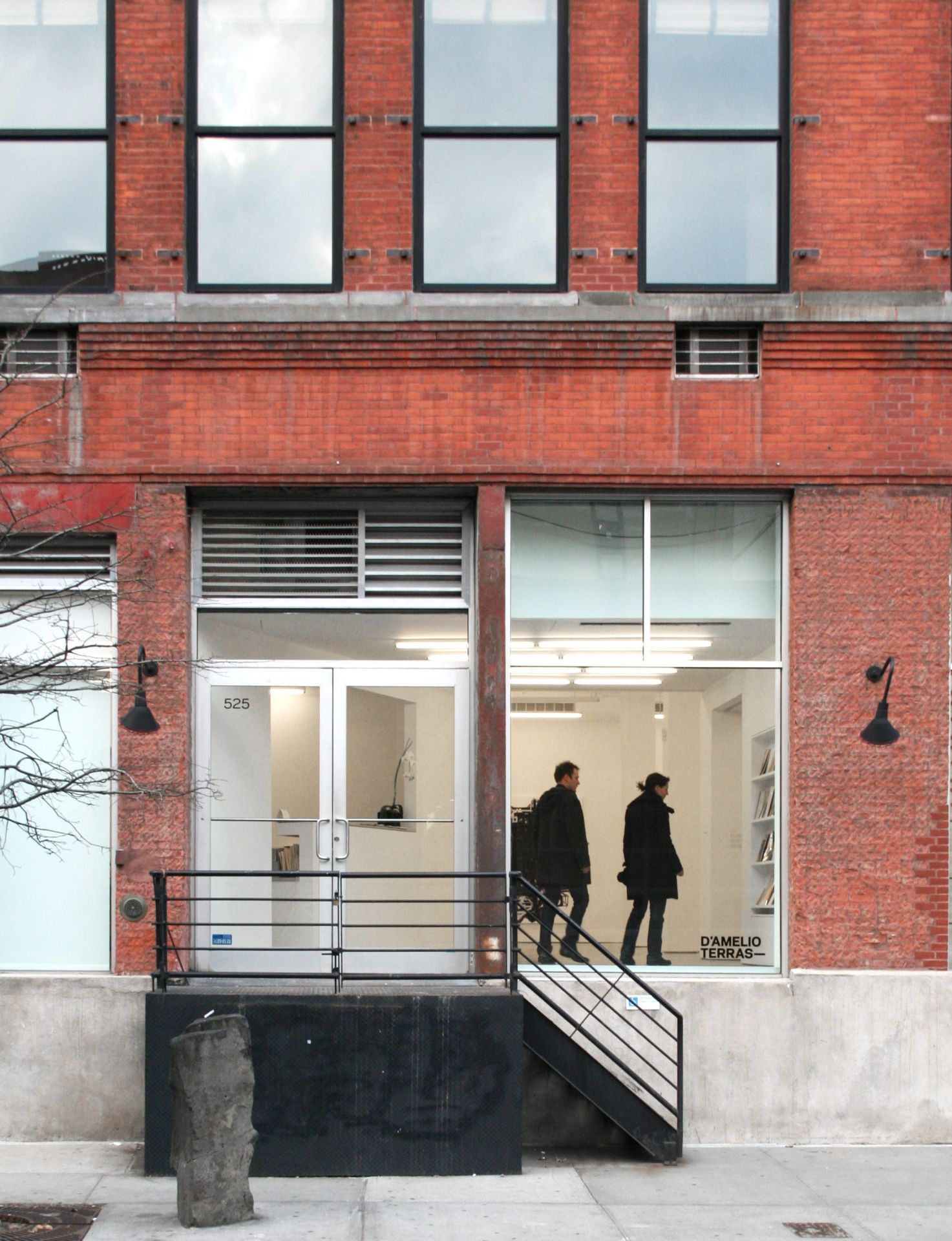
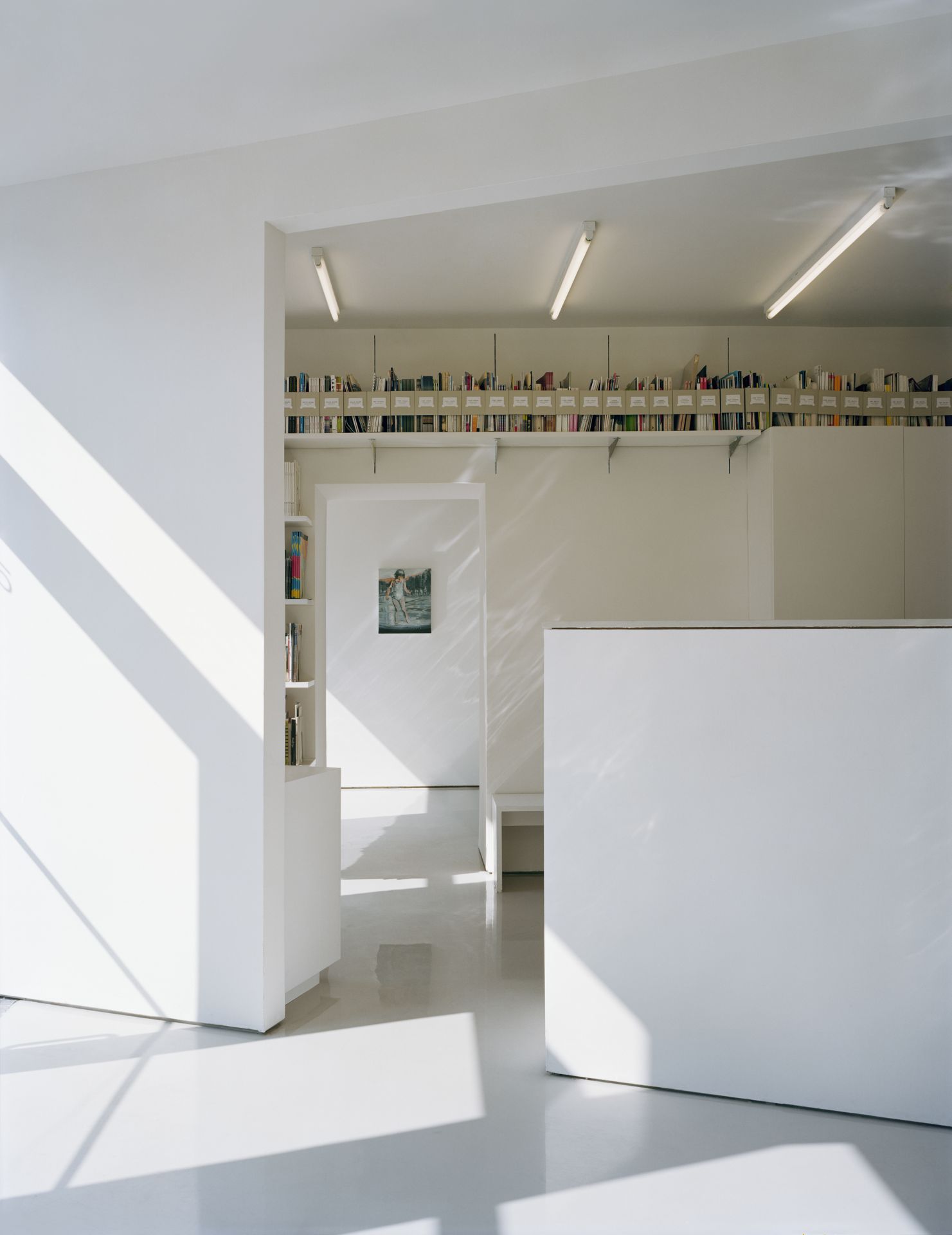
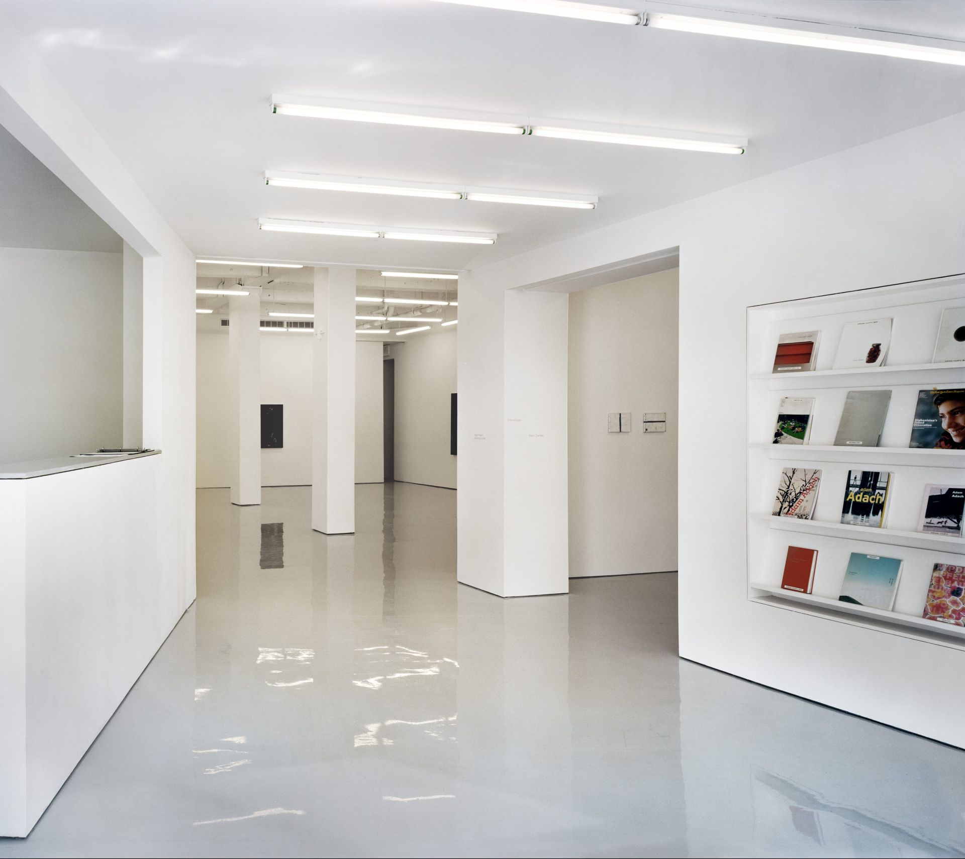
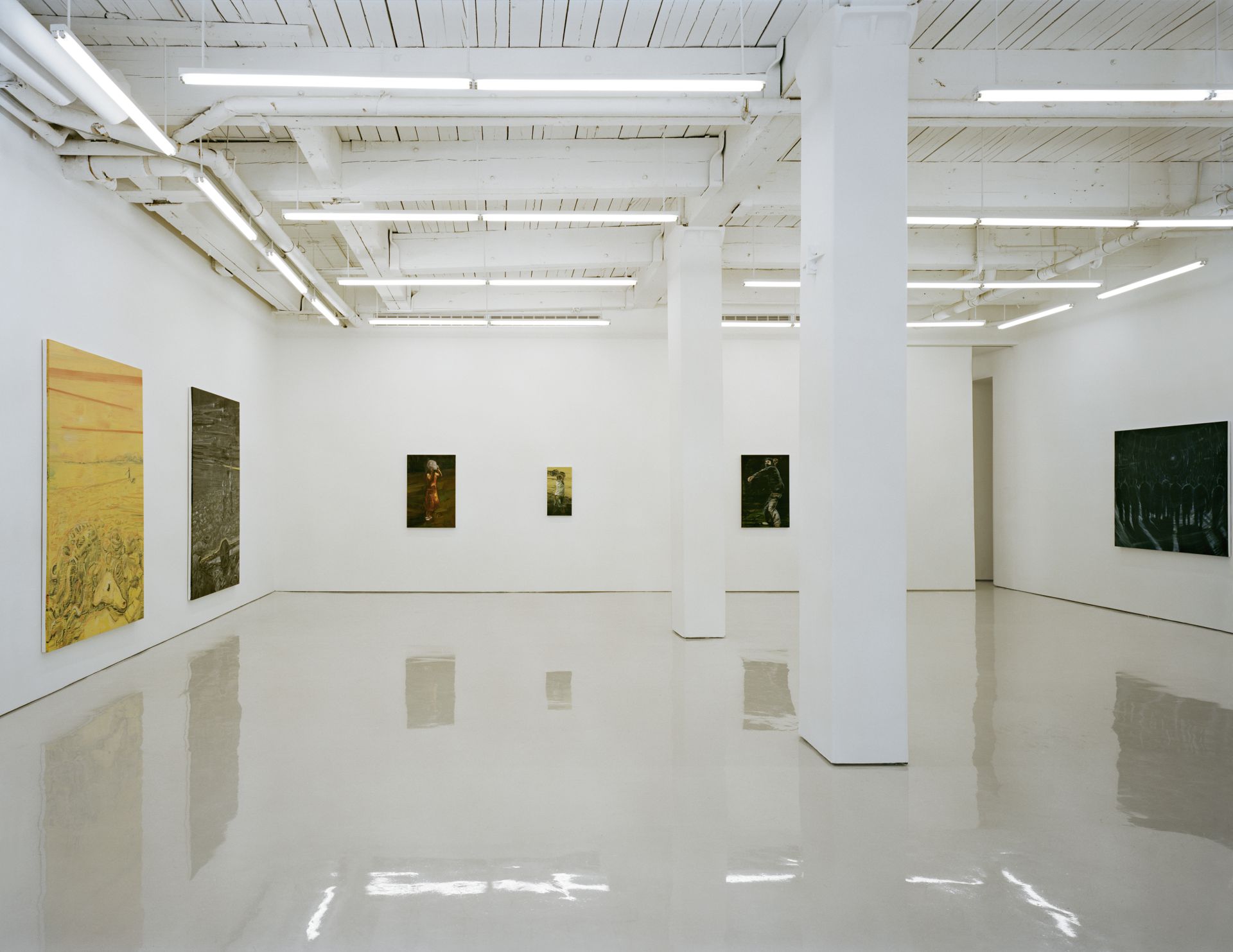
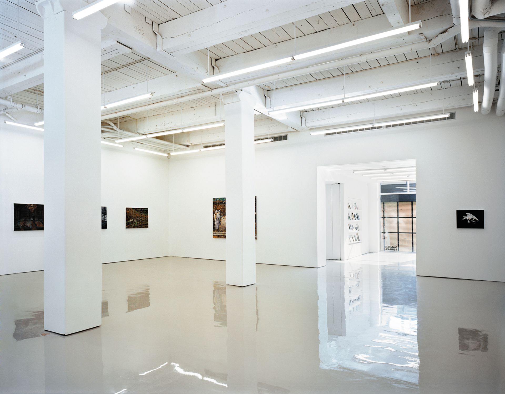
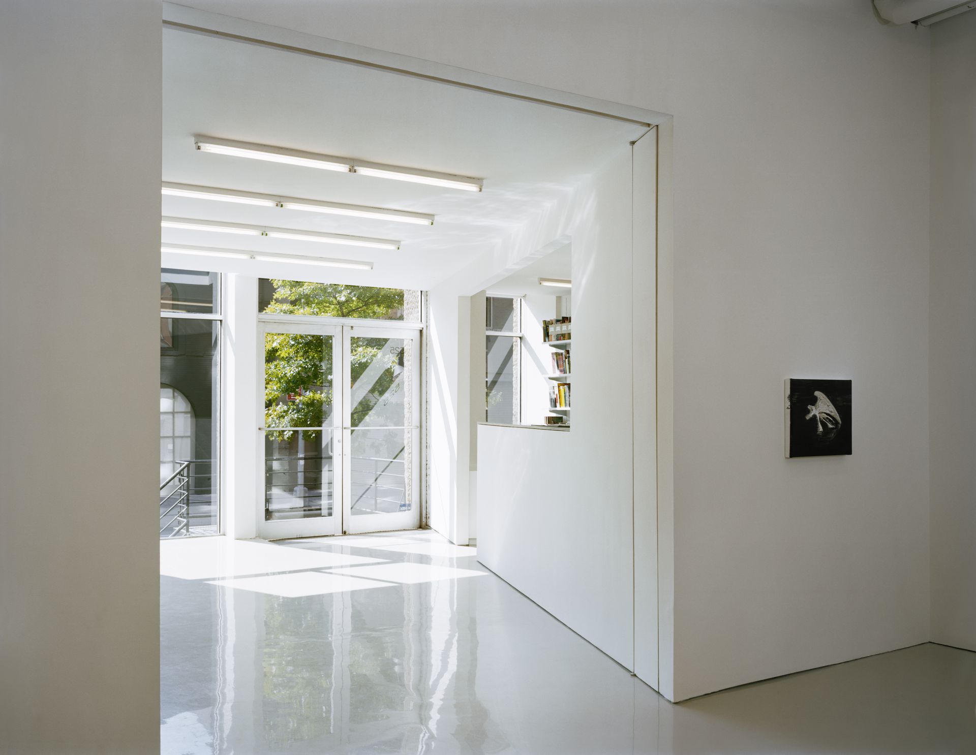
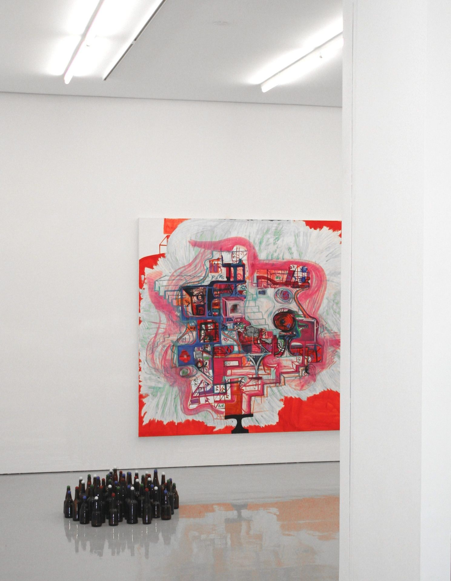
At a Chelsea gallery, two bold yet minimalist design choices exploit existing conditions to establish an immediately recognizable architectural identity. First, an almost-immaterial polished resin floor contrasts with the richness of the previously hidden rough wood ceiling – an inversion of the typical Chelsea gallery, where ceilings are usually pristine and the floors tend to be rough concrete. Second, a diagonal wall, containing the reception desk, takes advantage of a misalignment between entrance and gallery spaces. The resulting vestibule funnels visitors into the main gallery and stands out in a neighborhood dominated by right angles.
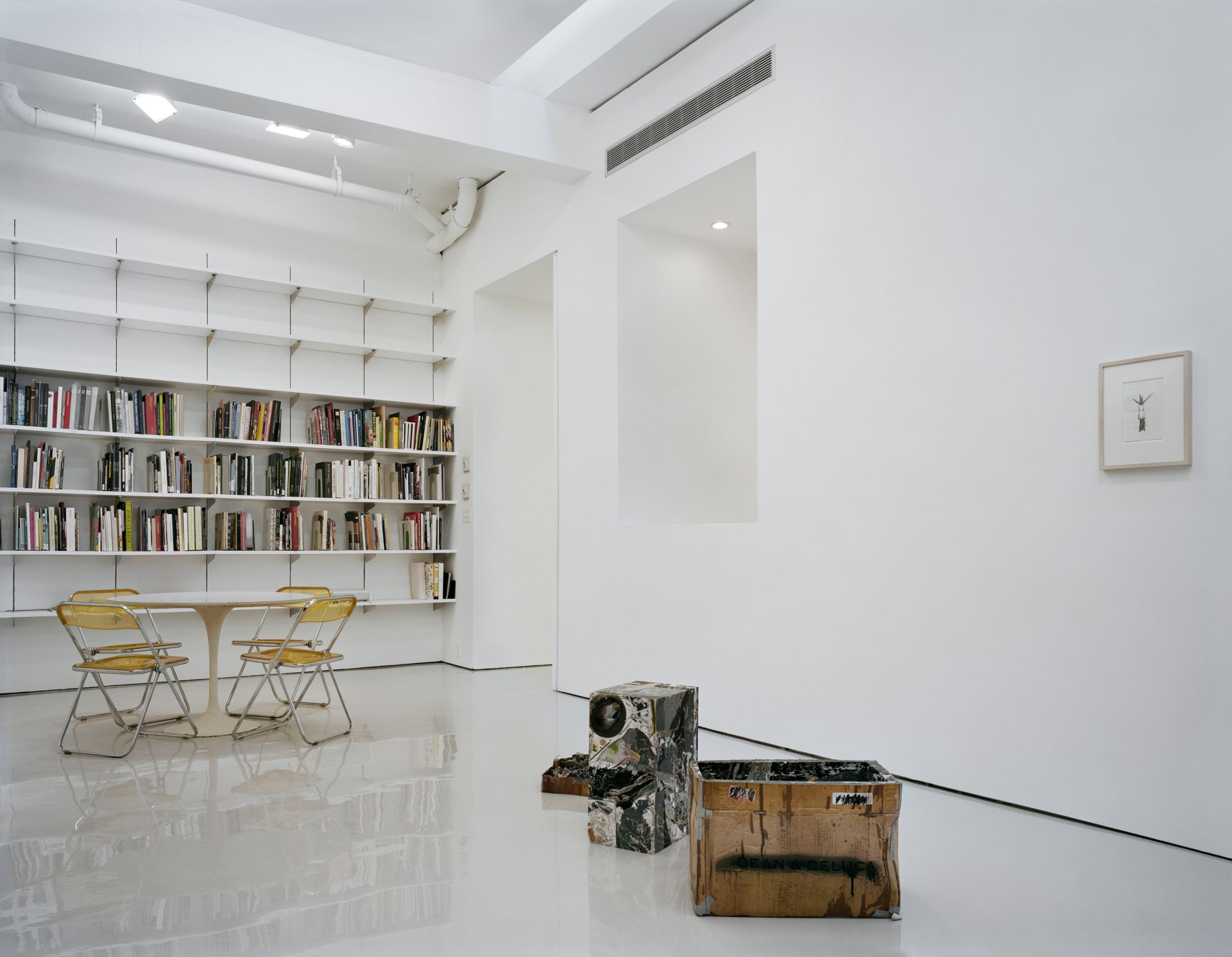
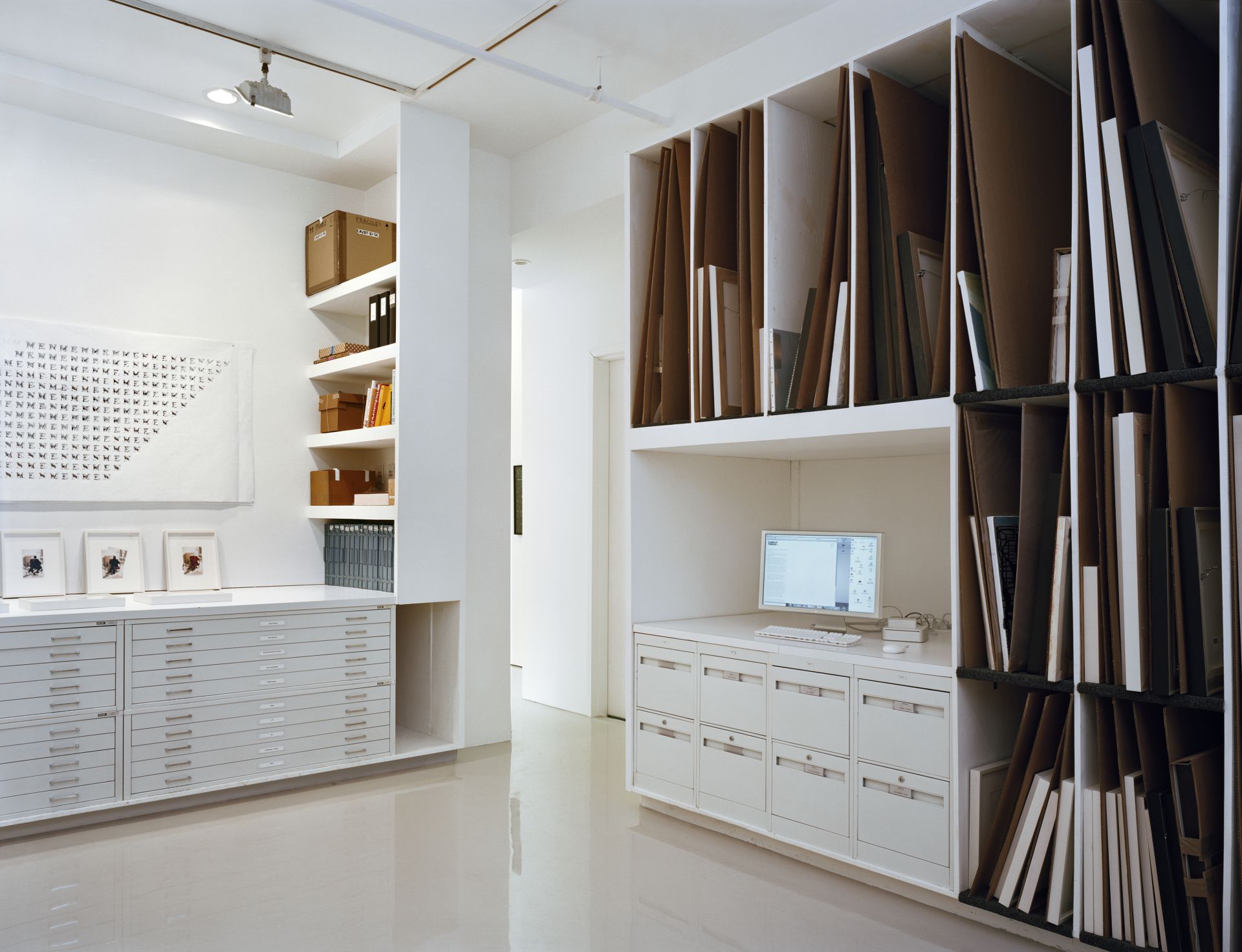
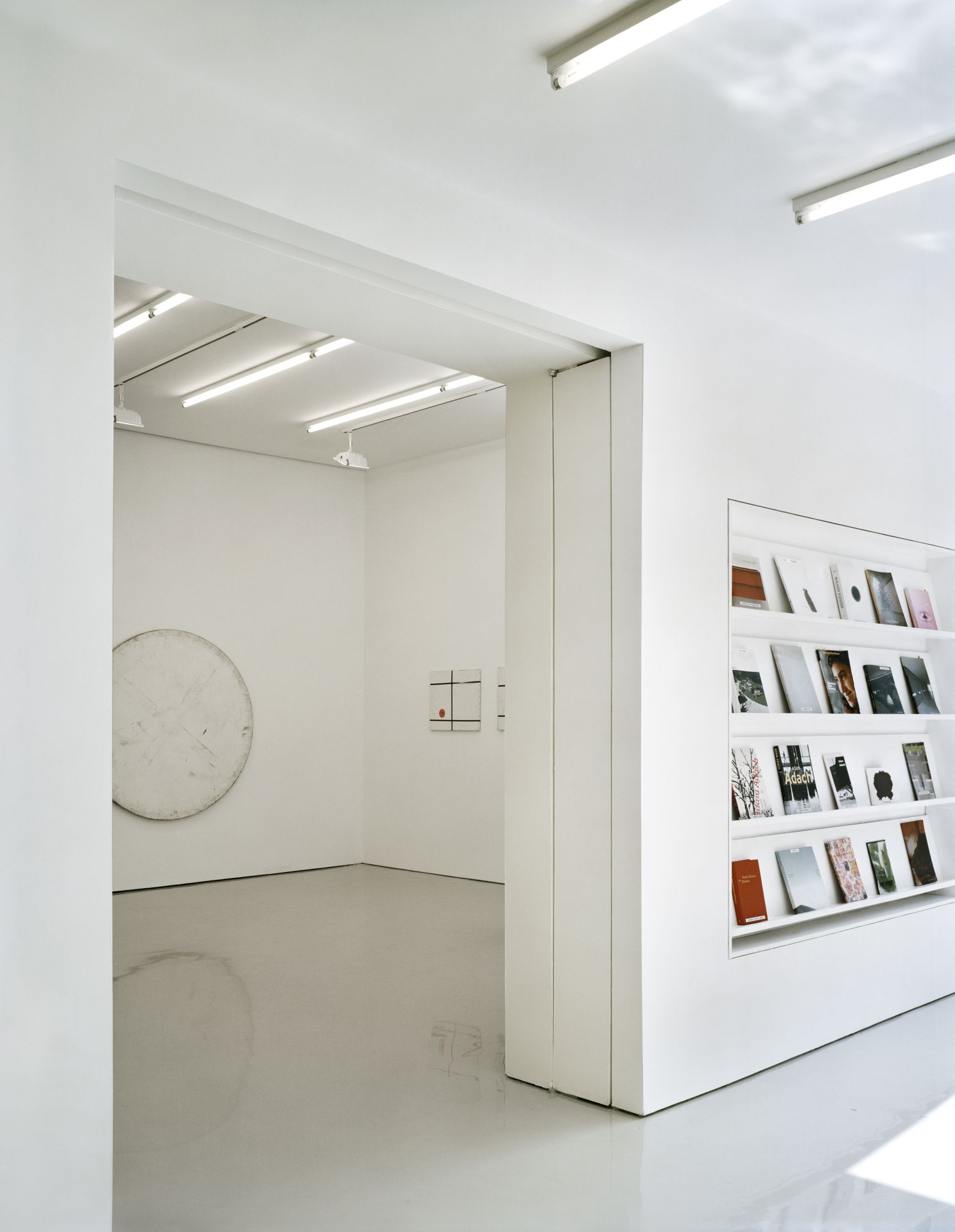
Around the main space, a smaller project room, back room, viewing room, and archive room give the gallery the flexibility to show multiple artists at once. Other simple but unusual details – recessed fluorescent light boxes, sliding walls, a bookshelf set into the wall of the vestibule – further add to the gallery’s unique identity.
